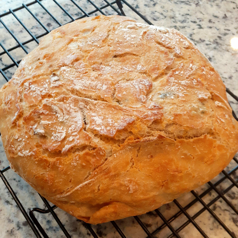
 loaf of bread 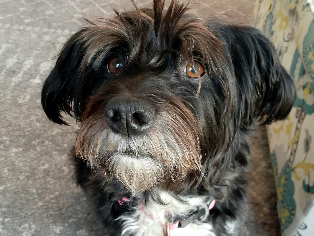 dog 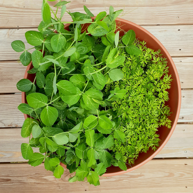 plants , These are three photos of my perspective during this pandemic. I used the rule of thirds and photo editing to enhance these photographs.
I purposefully used objects that had bright colors (without any added saturation). The color makes it stand out. I also cropped the photos to make them even and proportional, such as how two of them are cropped to be a square. The photo of the plants is centered on the garden pot, and it's an even 1:1 ratio, but the difference between the two types of plants in the pot makes it stand out. The idea behind these photos is to show what people are doing to occupy their time during this pandemic. For me, examples include baking, spending time with pets, and gardening, which is shown in these photos. These photos show this by being bright and colorful. It is intended to show that positivity is important, and that we can take advantage of this time and try new things (at home). It is important to not get overwhelmed with negativity during this pandemic. What I find successful about this piece is the idea, because although we can't just ignore problems or pretend that everything is going to turn out perfect, we should still find fun things to do and learn about new things. During this project, I learned how to edit photos better and increase their quality to be something that stands out.
3 Comments
Painting warm-ups 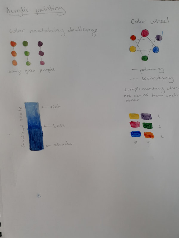 color matching, color wheel, gradient, and complementary colors 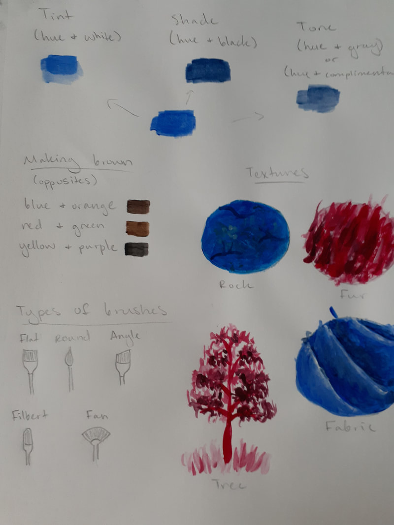 tint/shade/tone, making brown, textures, painting a tree Reference image and sketch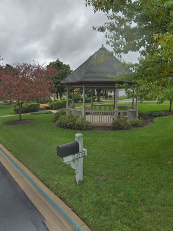 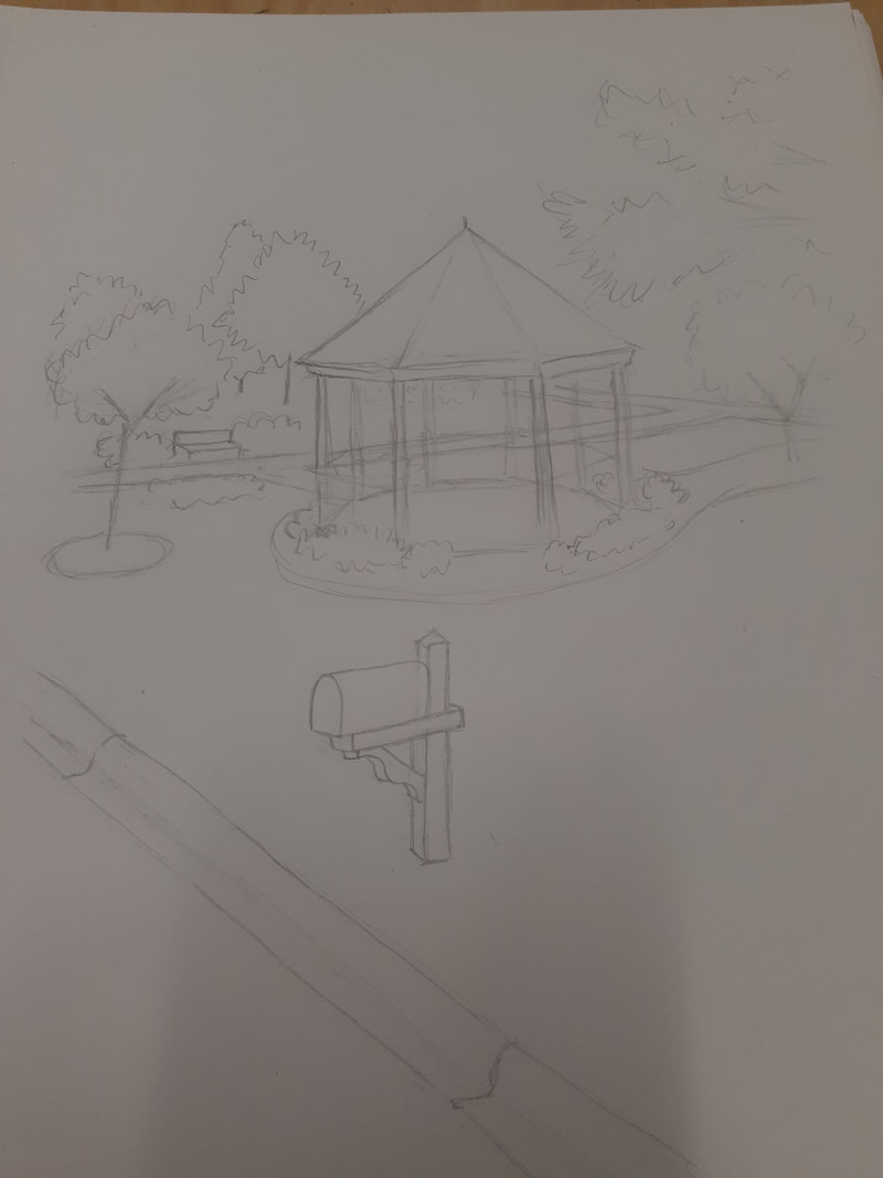 Most helpful warm-up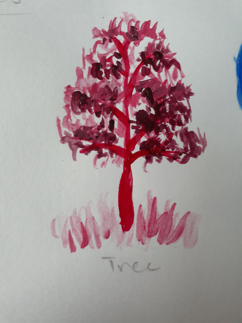 painting a tree Progress photos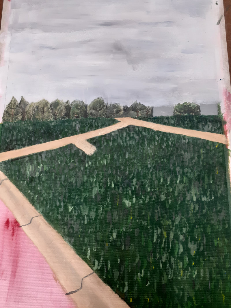 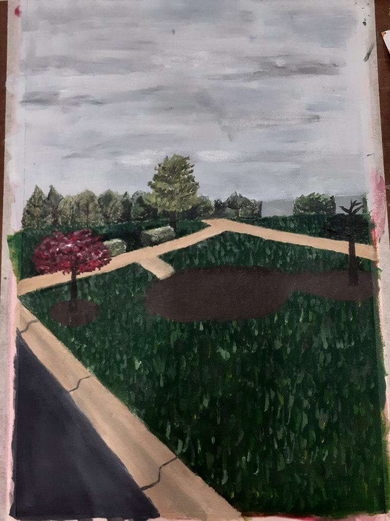 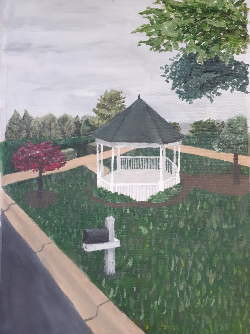 Final photo 1. This piece shows a space in the neighborhood I grew up in. It's important to me because I remember spending lots of time outside here.
2. The most challenging thing about this piece was the different textures. I had to paint a lot of trees, and the grass was difficult to get the right texture. 3. I think the most successful thing about my piece is the gazebo. It was a little difficult to get the perspective exactly right, but I think it looks good. The white is a good contrast from the green in the rest of the painting. 4. The process I did for this painting was to first paint the sky. Then I did all the trees in the background, and after that I painted the grass (for the grass, I painted a solid green layer and then added texture to it). After that I painted the sidewalks and the curb, then I added more trees and bushes. I painted the gazebo, first doing the ground then the fences and then the roof, as well as the mailbox. 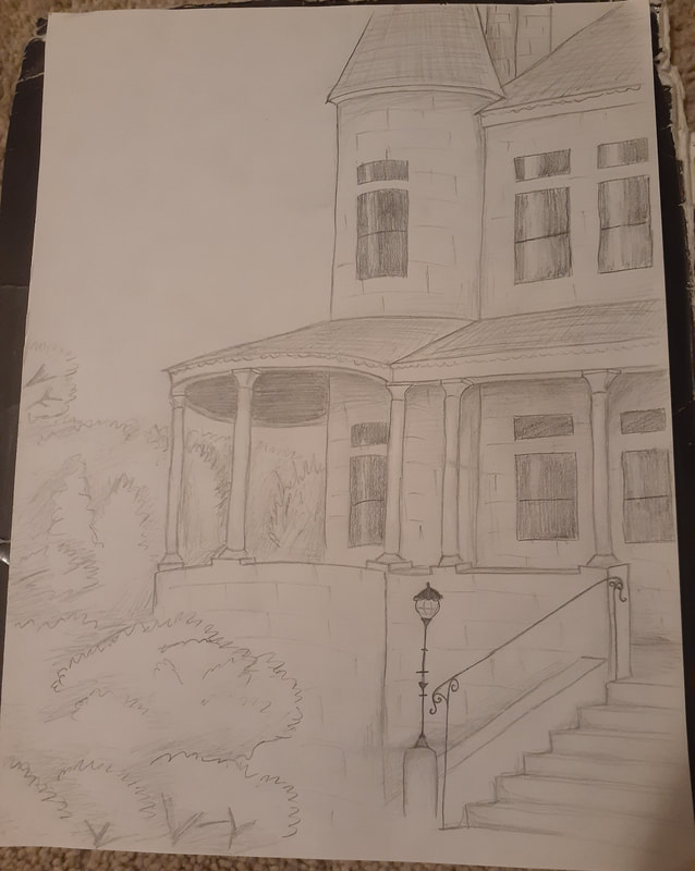 pencil 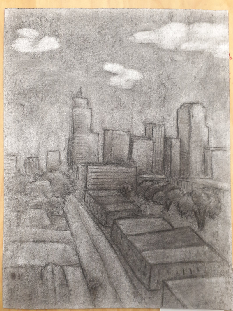 charcoal 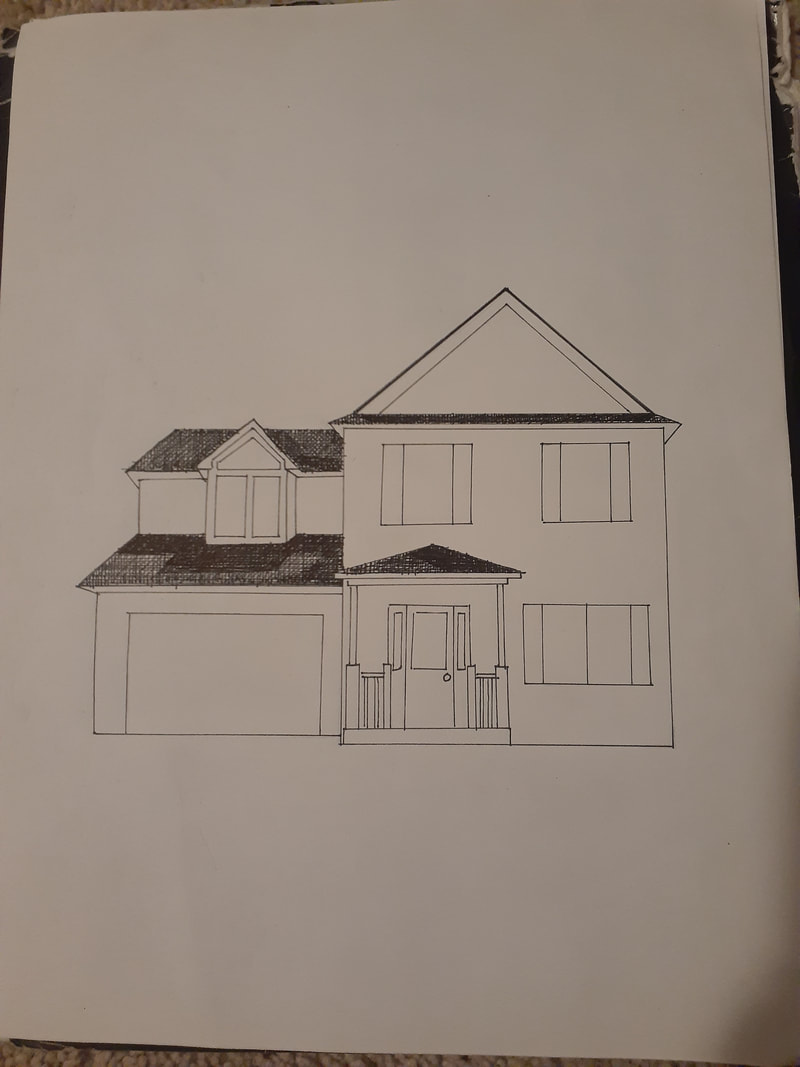 pen Most helpful warmup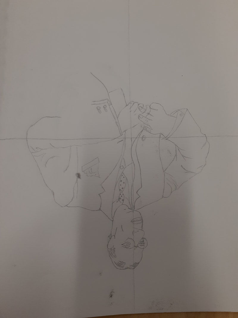 Personally, the most helpful warmup was the upside down Picasso drawing. You have to draw what you see, not what you know. That can also be applied to other drawings. The upside down Picasso drawing was made more difficult because of the fact that it's upside down. Even right side up, the proportions of the original reference image are a little off. So that's why it's important to draw what you see, not what you know. Definitionscomposition - placement or arrangement of visual elements or ingredients in a work of art value - element of design that defines the values of lights and darks in an artwork Pros and consPencil
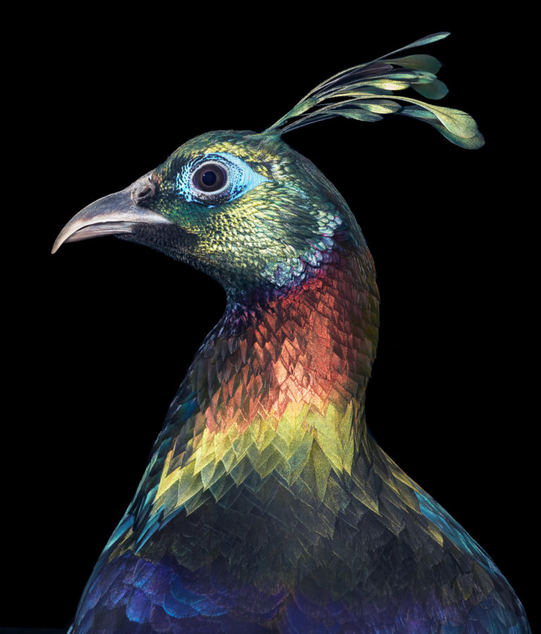
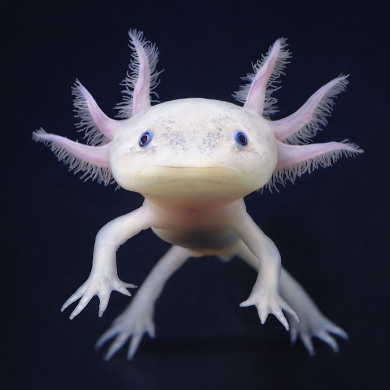
Pros - can add small details, can easily add value Cons - may smudge easily Charcoal Pros - easy to erase when using vine charcoal, can easily add value Cons - somewhat messy, hard to add small details Pen Pros - different techniques, can add small details Cons - can't erase anything Tim Flach is an animal photographer and has even published many books of his work. He is British and lives in London. Flach mainly does studio photography when he photographs animals, so it is controlled environment. However, he also does some wildlife photography as well. Most of Flach's books are specific to a subject, such as one featuring endangered animals or another which is only dogs. His work is inspiring because it shows many unusual species that aren't often encountered in the wild, so it's interesting to see them photographed. He also has many pictures of endangered species, which may encourage people to help with conservation efforts, in order to prevent the extinction of these animals. Also, it is interesting that Flach does a lot of studio photography with animals, some of which imitate a human portrait. It's intention is to create an emotional connection to the animal. Flach's work is also inspiring simply because it's colorful. The bright color draws people in. Especially with some bird species, which many people don't realize how colorful and unusual birds can be. Many of his photographs show endangered or even just unusual species. Shown below are two of his photographs. The first is of a Himalayan monal, a colorful pheasant native to the Himalayas. The second is of an axolotl, also known as a "walking fish." Flach does have his own website, at timflach.com. |
ArchivesCategories |
 RSS Feed
